Overview
Kadoa is an AI data extraction technology developed by the Looria team. I was tasked with creating a new brand and web app UI targeted at software developers (B2B, unlike Looria, which is B2C).
Iteration 1
The competition in this market is fierce, and I aimed to create a brand that would be distinctive and stand out from the crowd while still appearing 'normal' enough not to deter potential clients.
The design elements I decided to incorporate are:
- A screen divided into halves with dark and white; the division line transitions into waves below the fold.
- A modern monospaced font, somewhat reminiscent of a code editor.
Iteration 2
After observing significant demand for Kadoa from enterprises, we decided to refine the brand to enhance its appeal to enterprise customers.
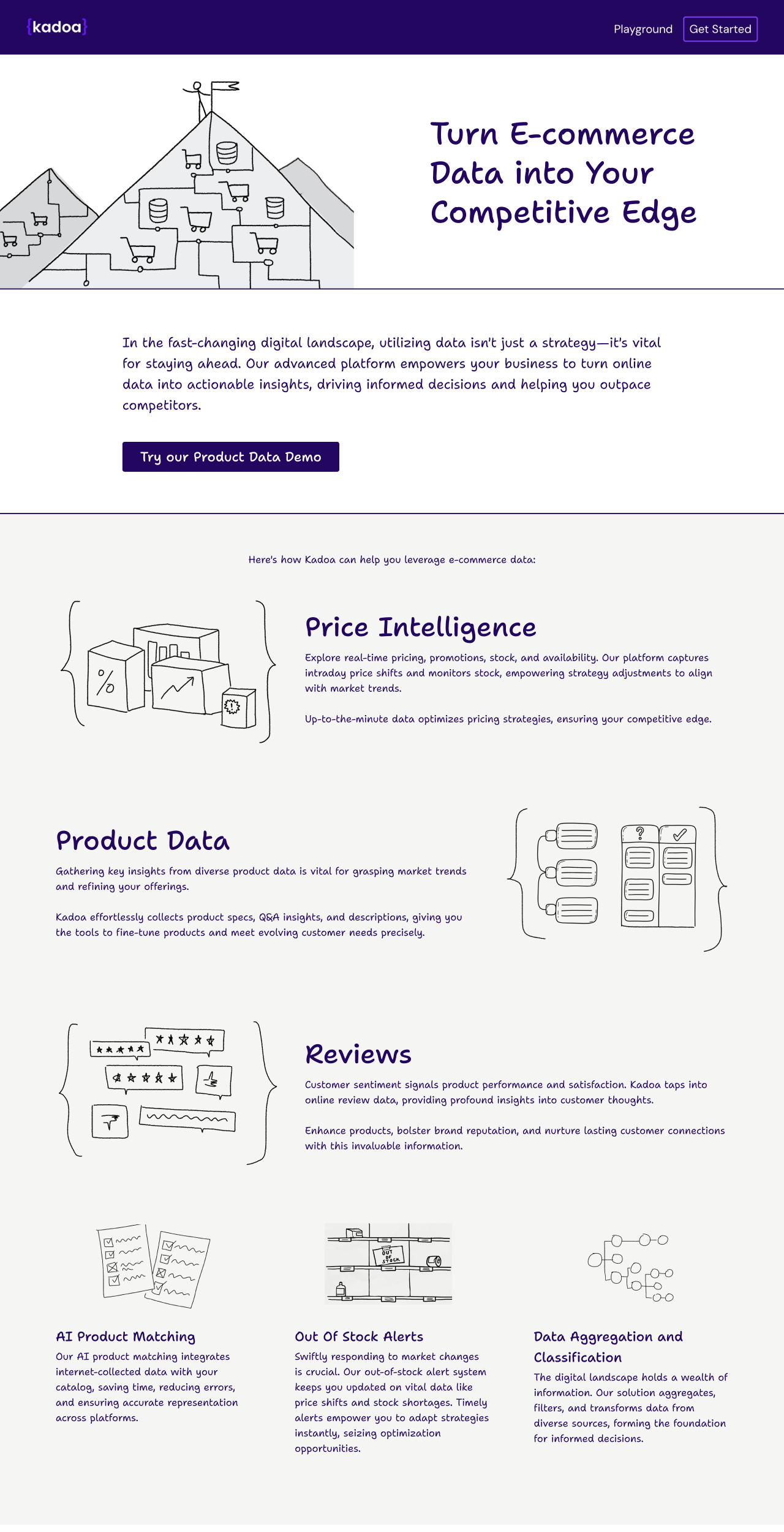
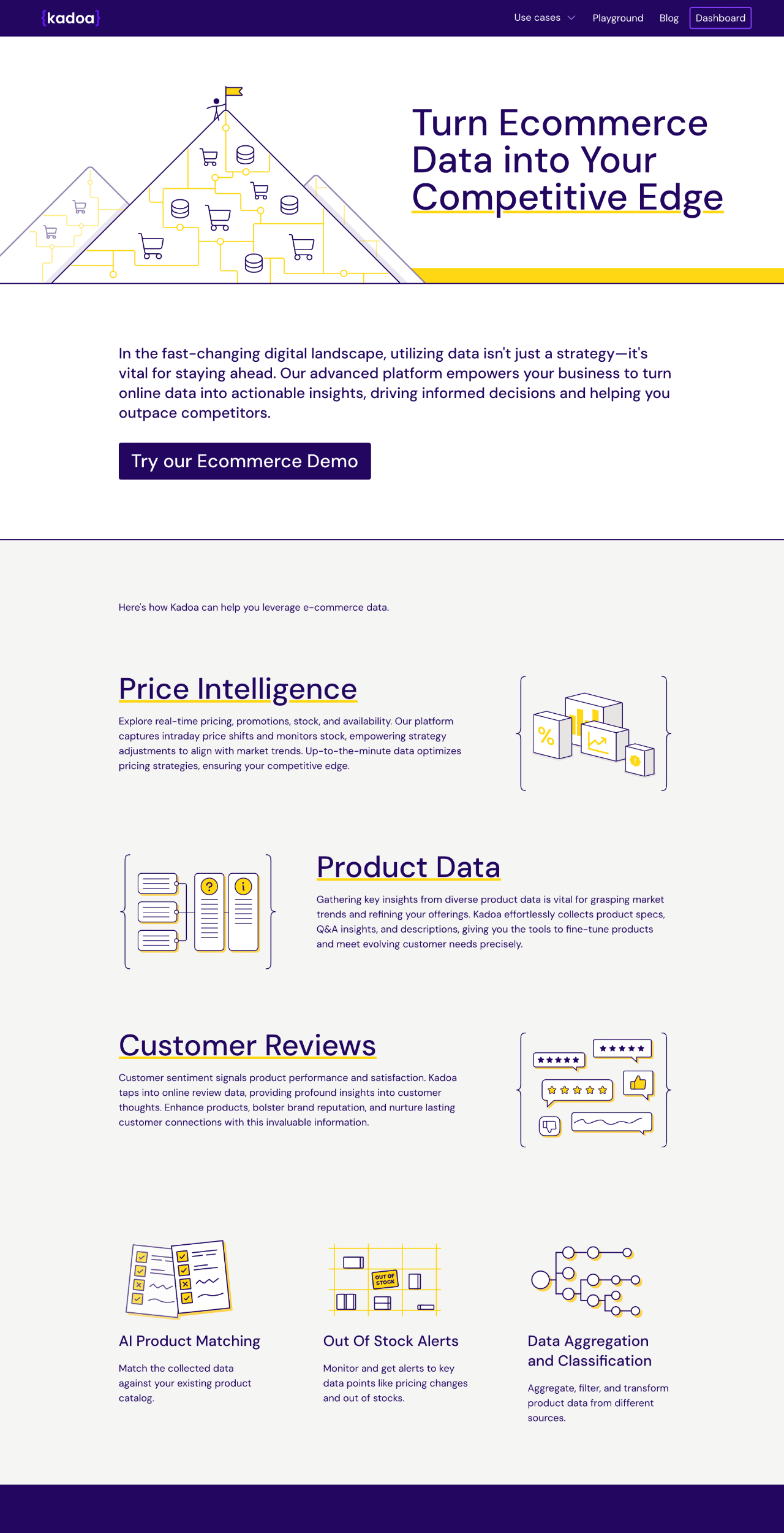
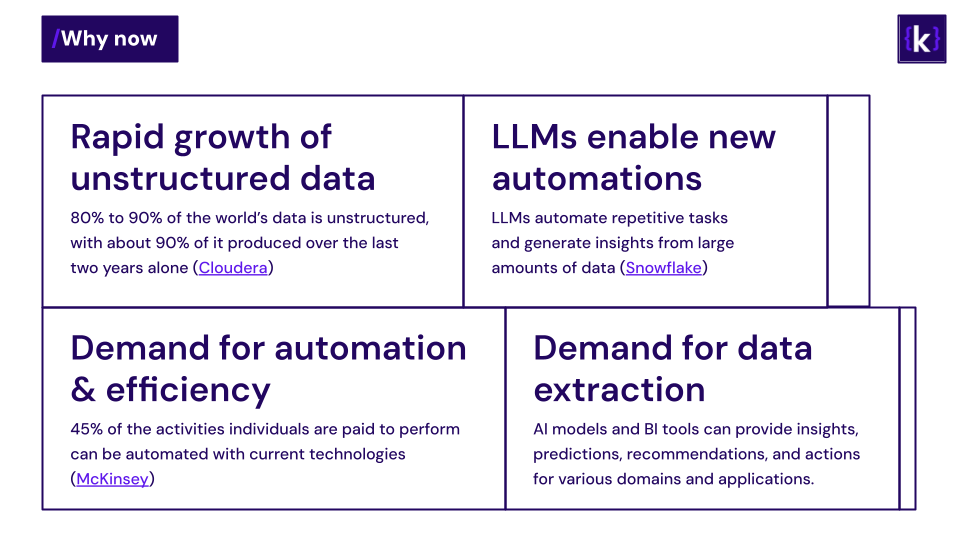
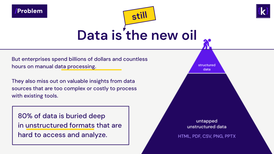
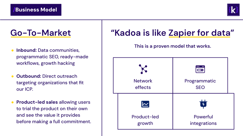
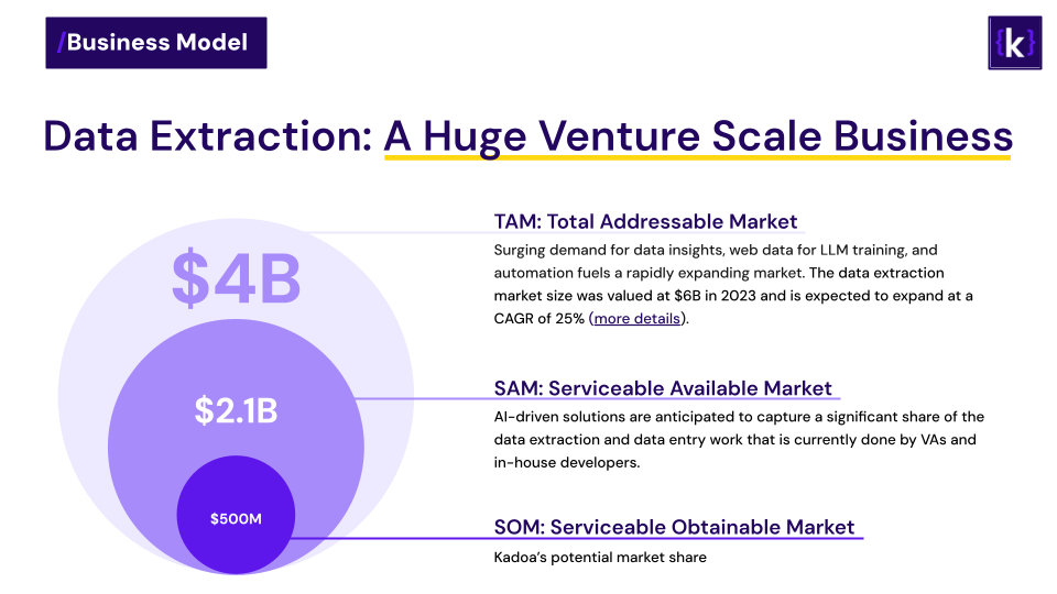
I consistently provided visuals for the team, including images for social media, use case illustrations, wireframes for new user flows, and pitch deck slides.
Web app UI
Kadoa is a web app, and I participated in designing most of its features. For brainstorming new ideas, we used Figma, and for actual design and delivery, I wrote HTML and Tailwind CSS directly in the product's React components.