Overview
Germany.ru is the oldest and largest Russian-speaking online community in Germany, with members from Germany, Ukraine, Russia, Belarus, and many other countries. Since 1999, it has been the most reliable source of information for people living in Germany.
I’ve been working with Andreas, website owner, to bring UX and UI to the next level, paying special attention to usability on mobile screens.
Roles
- Design system development and maintenance;
- User flows improvement;
- Front-end development.
Design system development and maintenance
The first step was to build a foundation – develop an efficient design system, including:
- support of multiple themes;
- set of design “tokens” for each theme (colors, fonts, margins, shadows);
- a rich set of front-end components (forms, cards, tables, buttons).
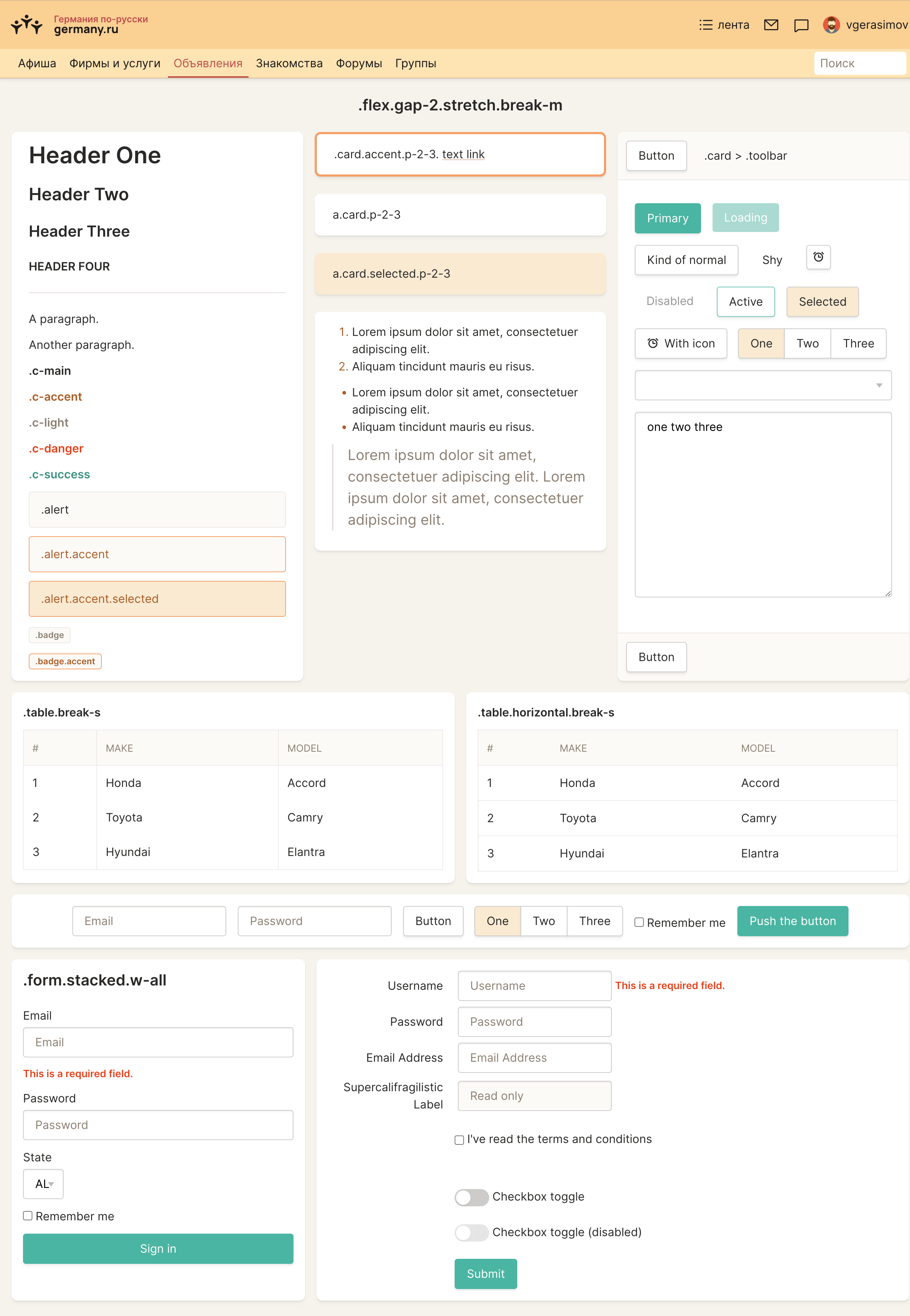
Design system demo page, showing some of the components:
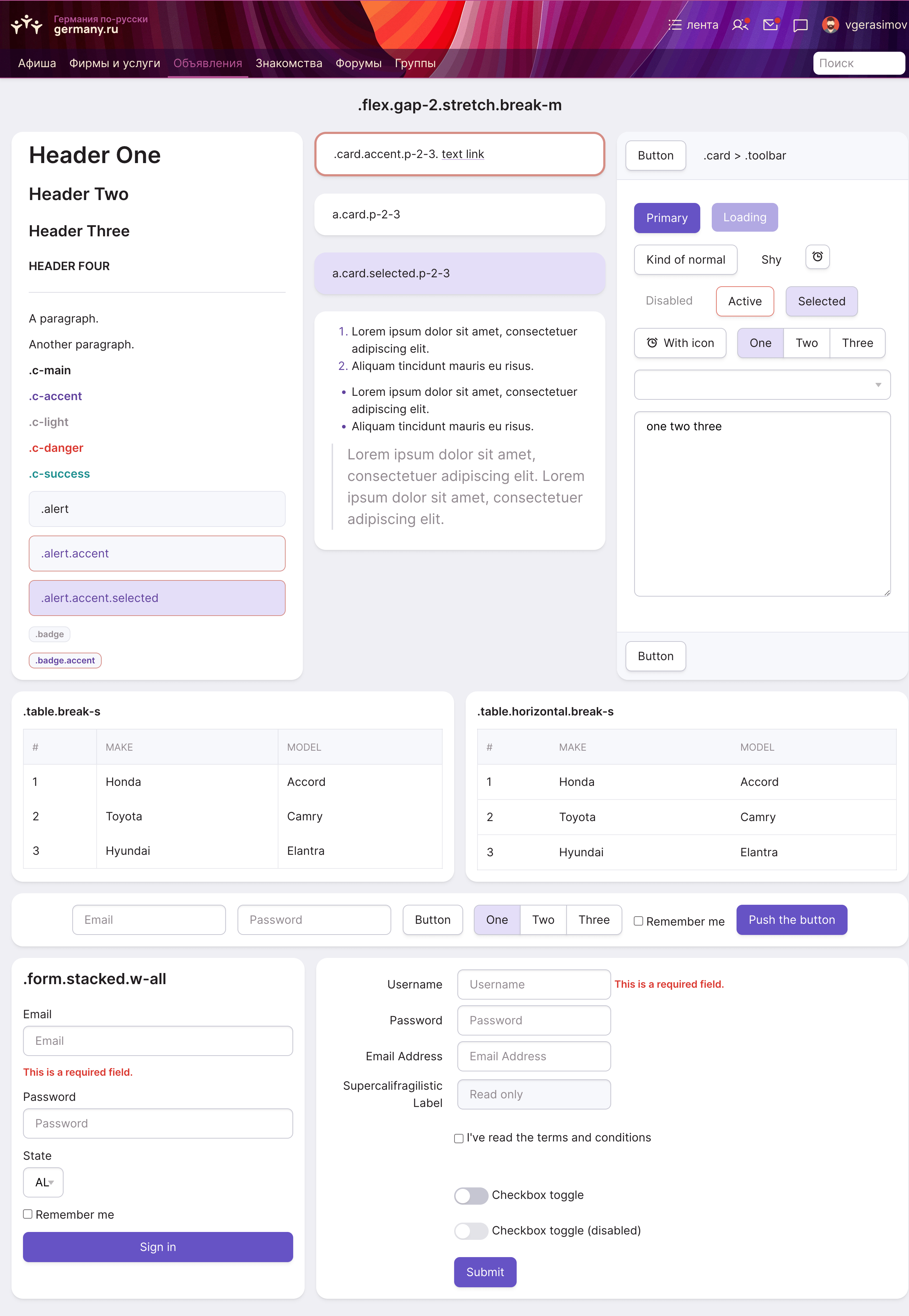
Same page, with a different theme:
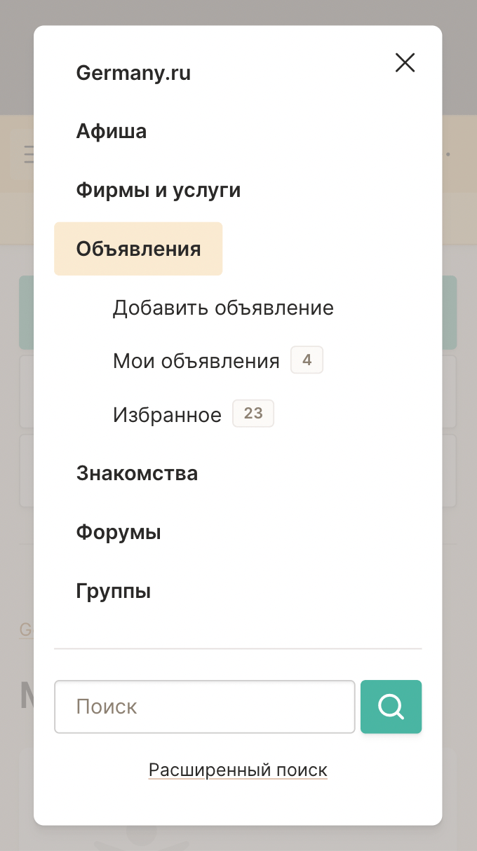
Every component automagically adapts to smaller screens:
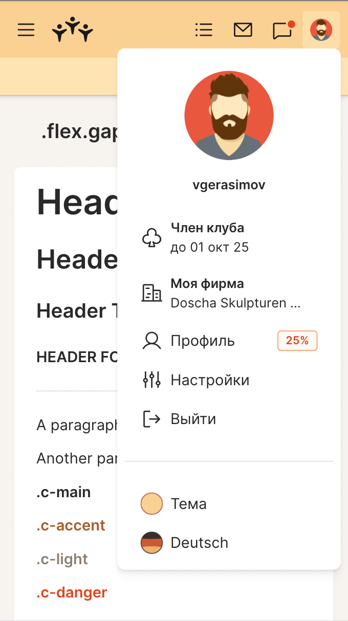
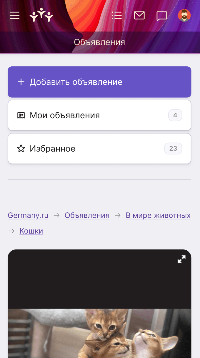
Once the system was in place, creating even a complex page has become as easy as putting together pre-made components. Ordnung!
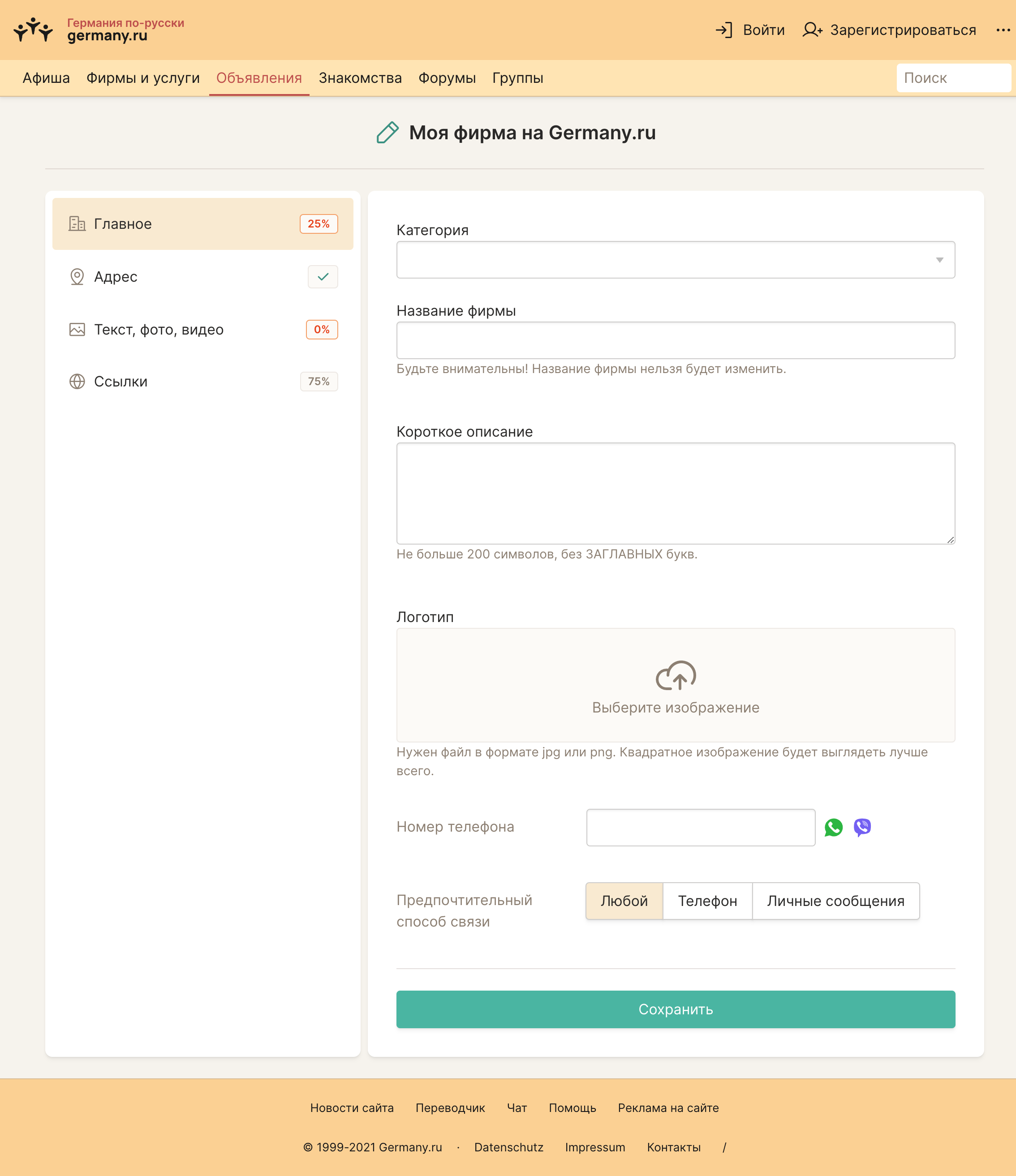
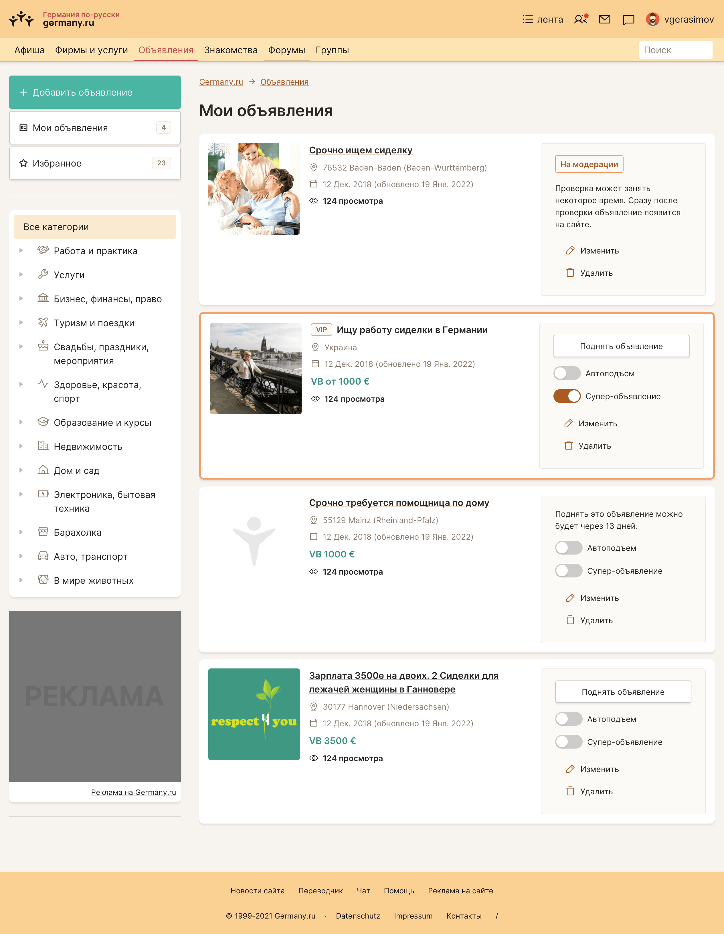
A relatively simple page, assembled from components in just a couple of hours:
User flows improvement; front-end development
Next, we sat down with Andreas, and discussed how we can improve and simplify user flows, section by section.
Normally, in similar projects, I would fire up Figma and make temporary quick “wireframes” that we could discuss and iterate on.
After that, I’d create a “final” design of webpages in Figma, and hand them over to front-end developers.
But on this project, I am both UX/UI designer and front-end developer. This allowed me to express my ideas as production-ready web pages, putting components together. It has been incredibly productive.
Before..
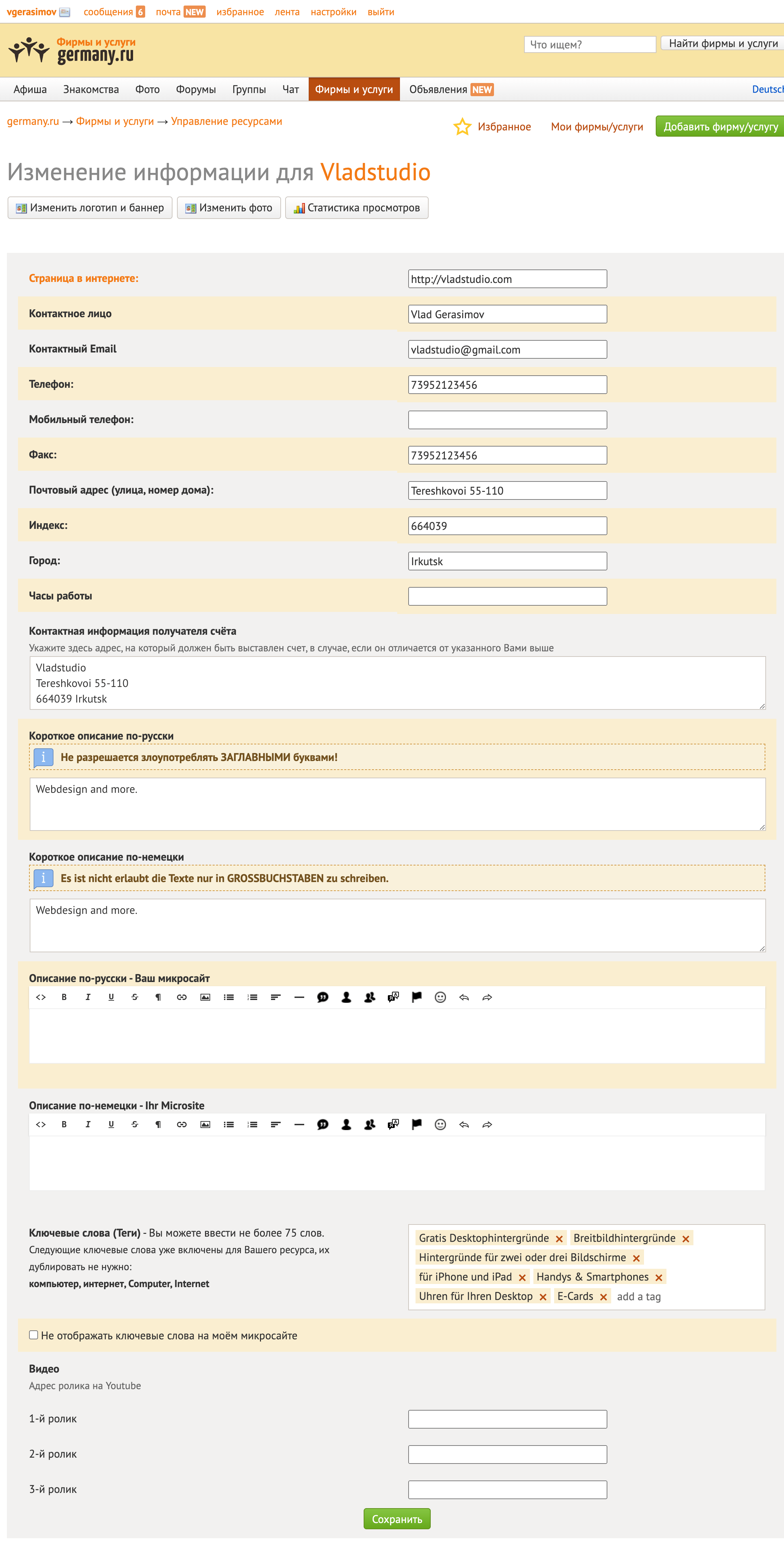
... and after:
