Overview
As a part of Reasoning Mind team, I dedicated myself to Blueprint – an online math curriculum for students in pre-K through first grade. Blueprint includes 300+ interactive lessons and has hundreds of thousands of active users (the product is currently owned by Imagine Learning).
Roles
I was lucky to participate in all stages of the product lifecycle:
- Worked with designers and artists to shape the product concept and “the Blueprint world”;
- Worked with business owners and product managers to define and document product features;
- Developed interactive prototype;
- Helped develop content production workflow;
- Helped create and maintain design library (interface elements, math content);
- Worked on documentation to efficiently communicate with other teams:
- Vision for business owners and product managers
- Content guidelines for knowledge engineers
- Technical requirements for software developers and testers
- Created a web app to analyse and revise lessons based on students’ results.
Project highlight: Interactive prototype
Problem
After the product team has agreed on the general concept and vision, we needed to describe this vision to the curriculum and software teams, so that they could get started.
Traditionally, this would be done by writing a lot of documentation and drawing some interface mockups. We needed to answer hundreds of very precise questions, such as:
- what types of interactive mechanics do we need?
- what colours and shapes to use in illustrations and diagrams?
- how do we scaffold incorrect answers?
- how do we keep kids focused?
For most of these questions, the answer was “we don’t know until we try”.
Solution
Instead, we decided to develop an interactive prototype of an entire 15-minute lesson (introducing number 3). I used my programming skills to develop a set of interactive HTML/JS pages, each page representing one exercise or educational video. We aimed to make it as polished as possible.
After less than a month, the prototype was ready. We tested it on a group of kids and then presented it to the entire company.
The feedback from development teams has been very positive. Everyone understood exactly what needs to be done, simply by looking at the prototype. I’m proud to say that almost all ideas we tested made it to the release.
Project highlight: Login Cards
Problem
One issue teachers mentioned a lot in the interviews is that the login process is difficult for 4-6-year old kids. When using similar products, teachers often spent 15 minutes (several times a day!) helping kids login with usernames and passwords.
Solution
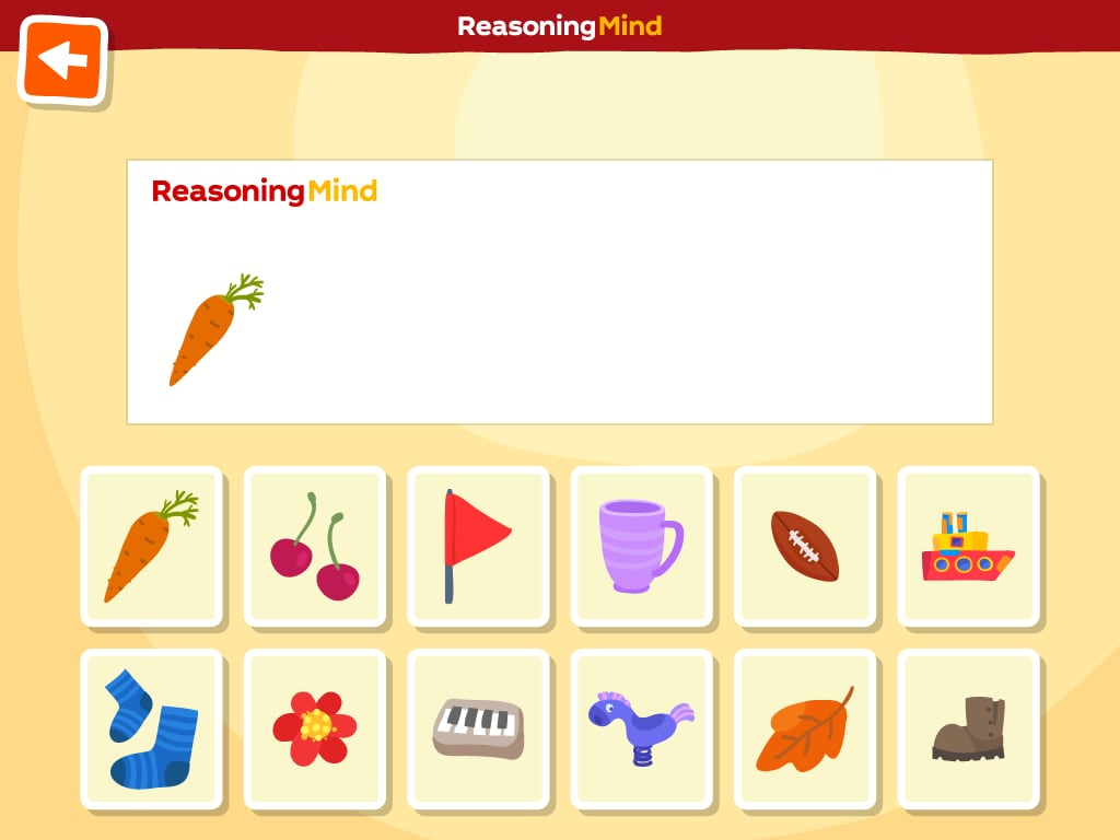
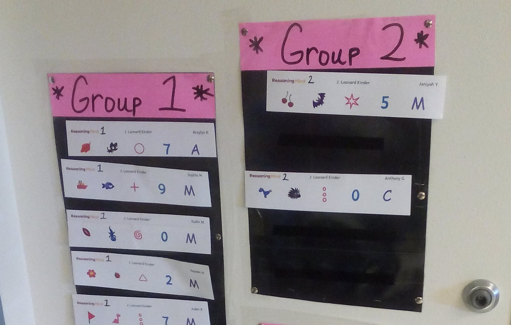
I came up with the idea of Login Cards, where each card contains 5 simple symbols.
- Teachers print login cards for all kids in the class;
- Kids login using the pictures in their cards.
The feature has been very successful. In later interviews, teachers said that login time dropped from 15 minutes down to 30 seconds! Unexpectedly, most kids memorised their cards after a couple of logins, and did not need paper cards at all.

